Torsk Aquavit
Distilled Scandinavian spirit aquavit, the drink of Vikings
Category
Branding
Packaging
Multicultural
Deliverables
Custom Logo
Packaging
Social Media
Credit
Sean Bacon
Bradford Prairie
Overview
Torsk is a Norwegian aquavit spirit distilled from barley. It has a dominant flavor of caraway seeds and other aromatics like citrus peel and whole spices. Torsk is a truly unique triple pot distilled drink which brings you the authentic essence of Norway.
The brand takes a strong and clean approach to the beverage industry. Torsk targets middle to upper income male consumers, ages 25-55, looking for a unique and fun alternative.
Solution
To effectively communicate the rugged, viking personality of the brand, I used Norse typeface inspired by nordic epigraphy. Distinguished by their sharp angles and almost rune-like shaped letterforms, it brings a sense of mystery and strength to the project. I combined it with geometric sans-serif typeface Neutraface, which has a clean texture, giving the brand a balanced feel.
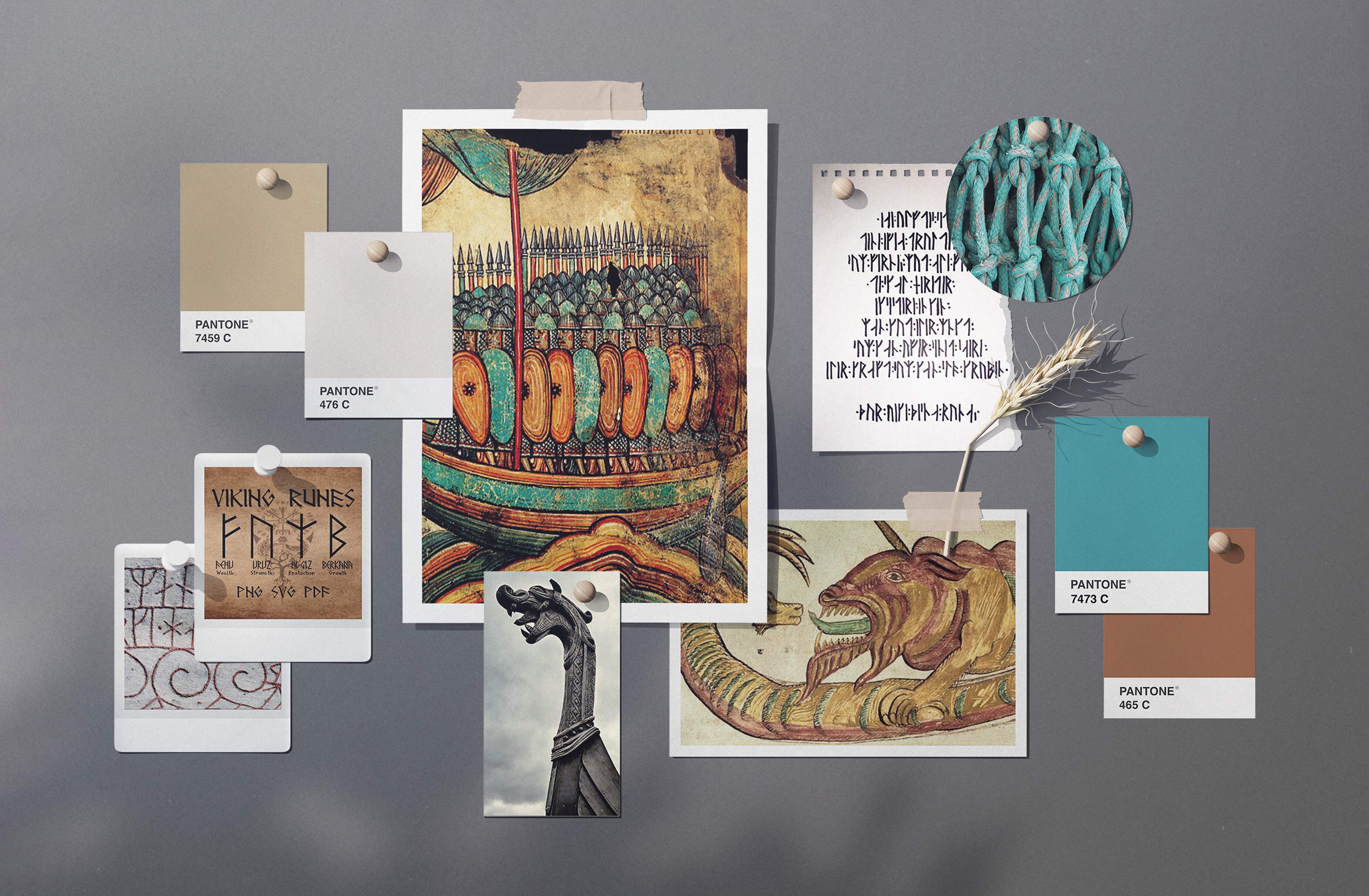
An earthy palette of natural browns with a distinctive teal complement the dominant black figures of viking longboats. The brand expresses its unique and authentic roots with an attractive identity and down-to-earth visuals.
01/
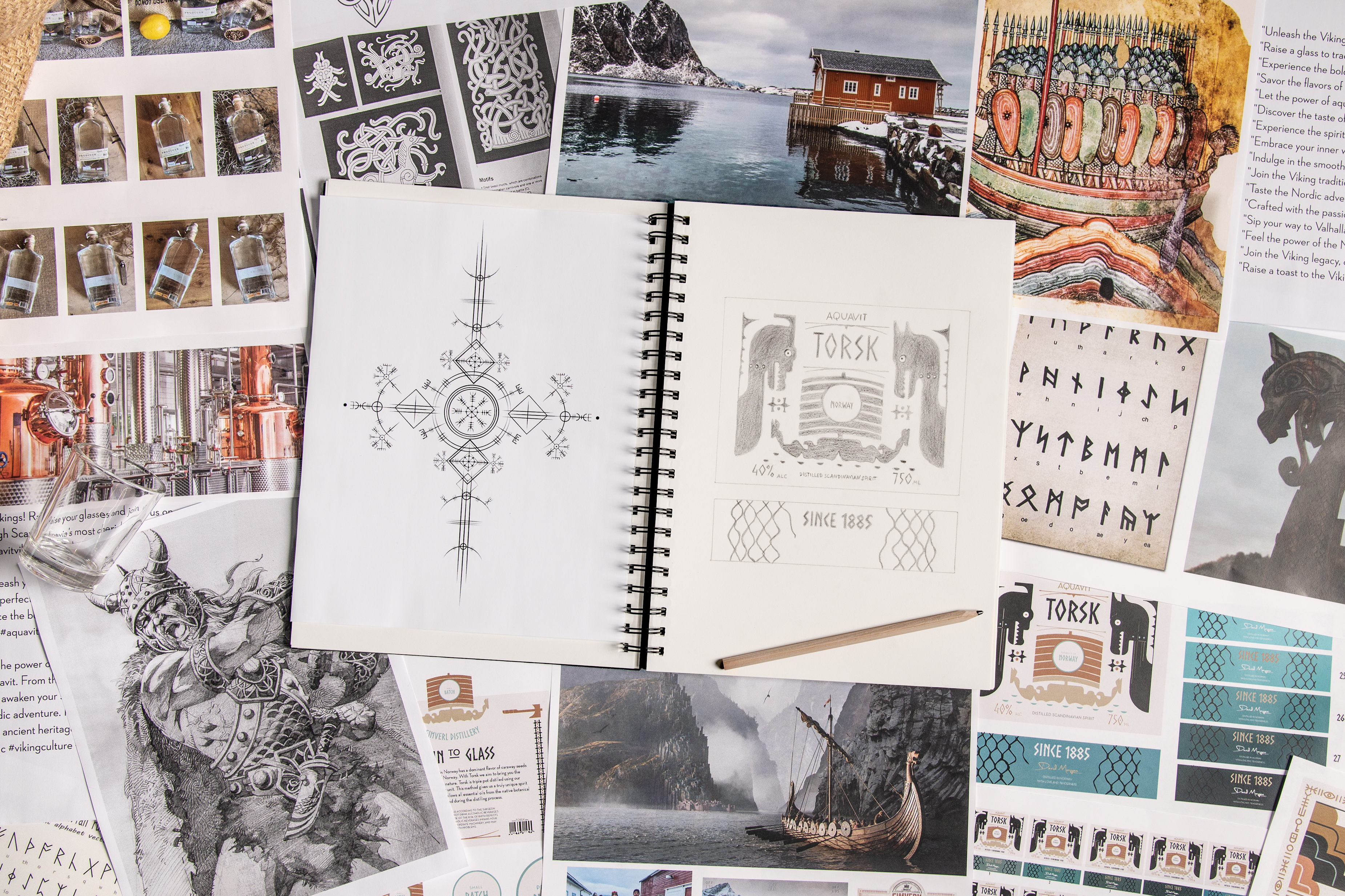
Design Process
02/
Moodboard
03/
Logotype
Drawing inspiration from the art and symbols of the Viking era, I hand-sketched a logo that captured the adventurous spirit of the brand. Incorporating elements such as runes and the distinctive figures of Viking longboats, I created a modern logo that pays homage to the rich history and mythology of the Viking era.
04/
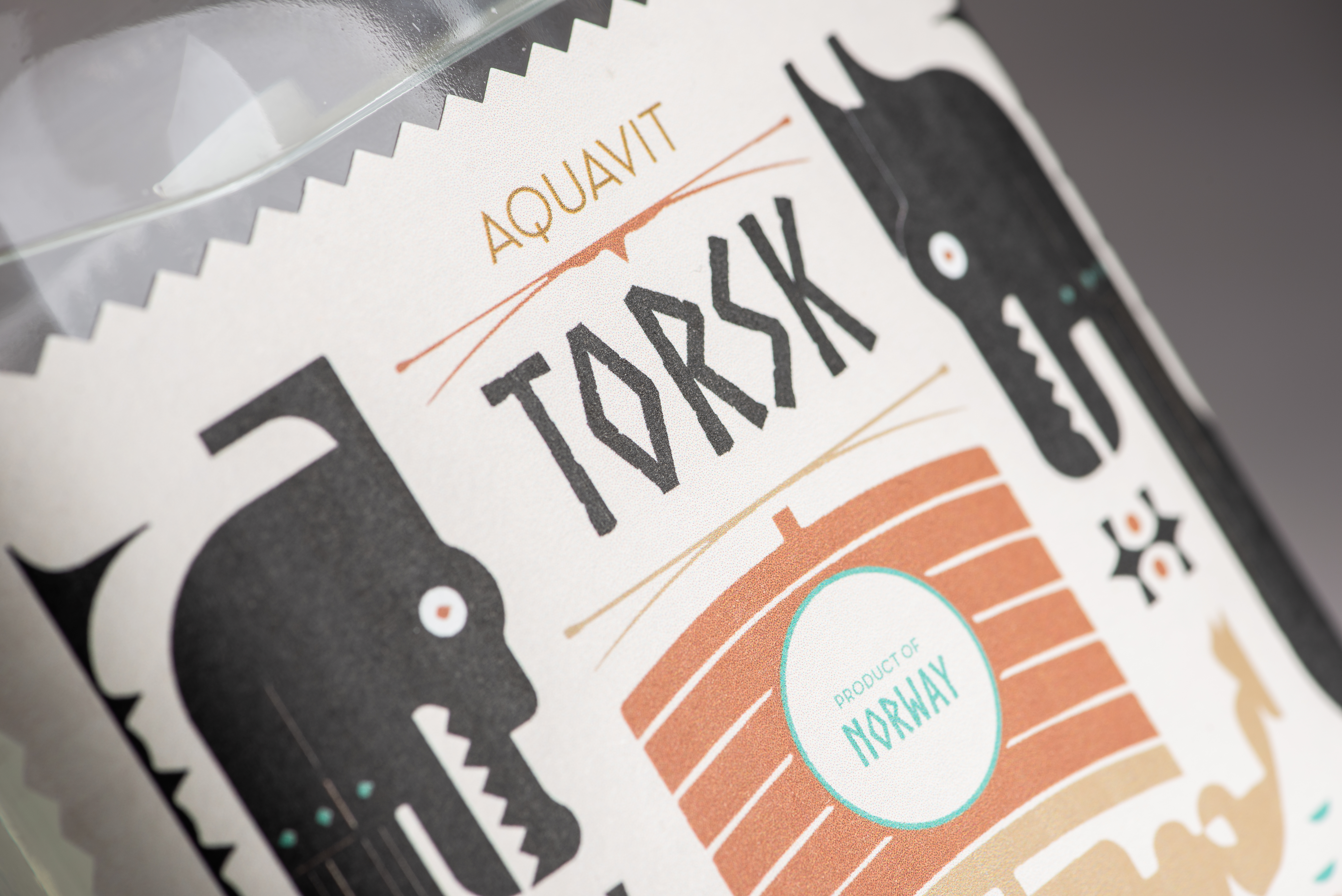
Packaging Design


05/
Social Media


