

Romanov Hotel
Elegant hotel inspired by the Russian royal palace
Category
Branding
Packaging
Multicultural
Deliverables
Custom Logo
Packaging
Social Media
Credit
Sean Bacon
Bradford Prairie
Overview
The Romanov is a luxury boutique hotel with a historic Russian ambience located in Beverly Hills, California. Named after the last Emperor of Russia, the Romanov Hotel was founded to serve with the same royal commitment.
Guests are cherished and pampered as noble royalty. The hotel attracts tourists looking for a themed aristocratic experience, and a primary market of high-income individuals and couples, ages 35–55.
Solution
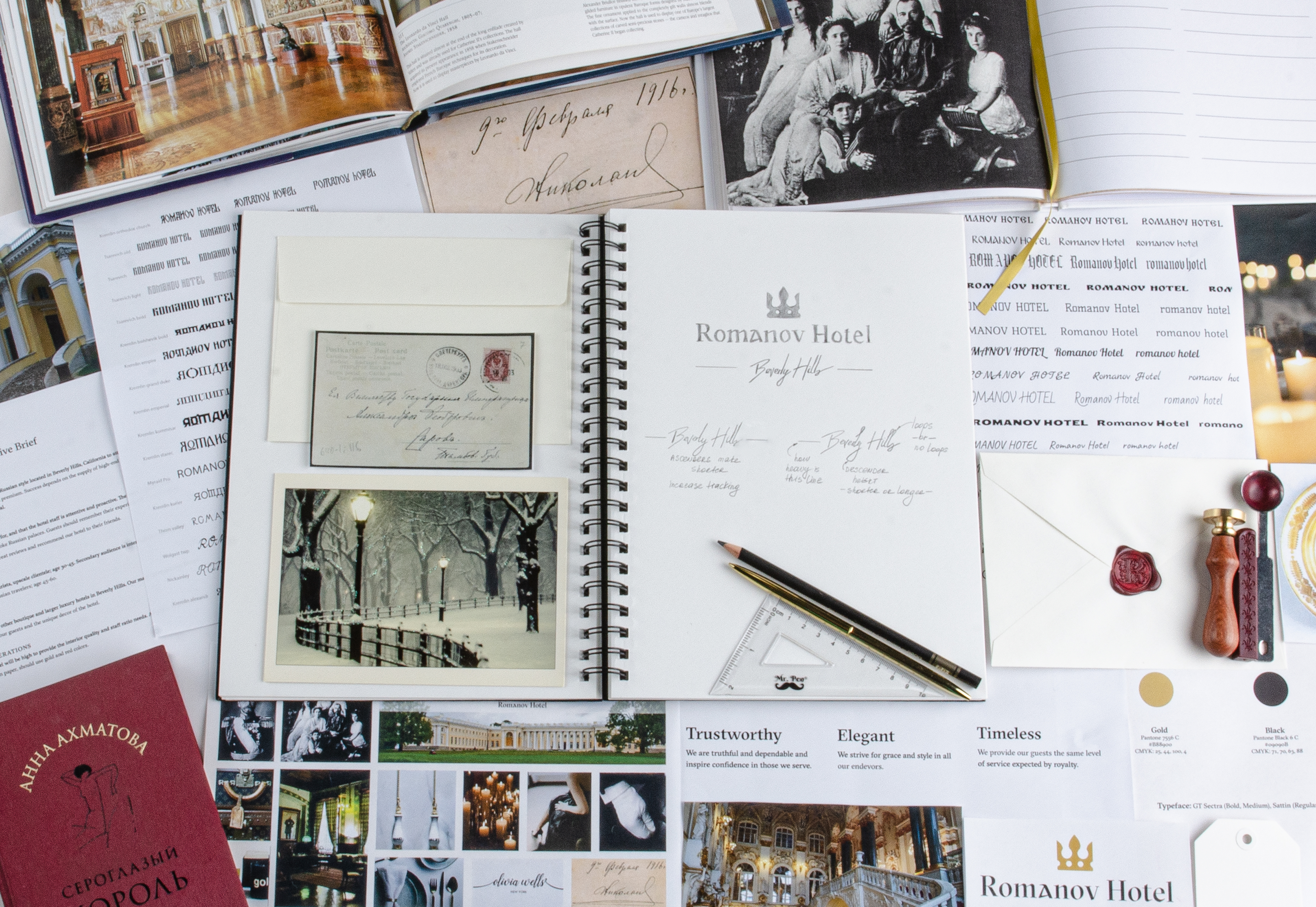
The Romanov Hotel brand uses a luxurious color palette of gold and burgundy, giving it a high-end and classic look. An elegant, sophisticated gold pattern resembles those of the authentic Romanov palaces, and is used to showcase the culture and connect to guests through intricate details.
The logo was modified from the high-contrast Bulgaria Moderna typeface, inspired by the Cyrillic script developed in the 10th Century. GT Sectra, a serif typeface with timeless elements of calligraphy, is used for its readability and contemporary proportions which add unity to the branding system.
01/
Moodboard

02/
Logotype
03/
Design Process
04/
Packaging Design


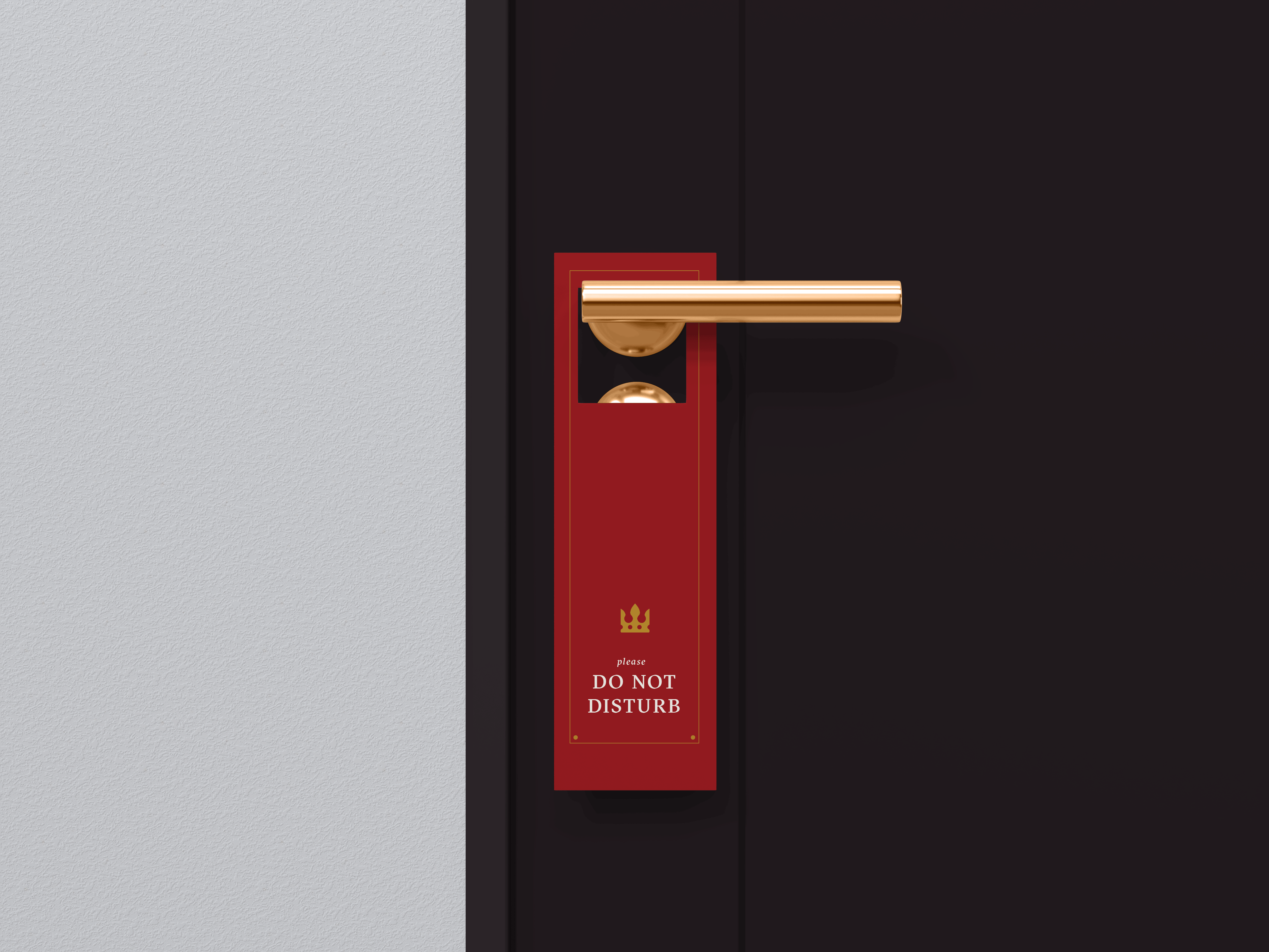
I incorporated the luxurious color palette of gold and burgundy used by the Romanov Hotel brand into the design of the door hanger, resulting in a high-end and classic appearance that aligns with the brand's aesthetic.

To create a feeling of aristocracy for our V.I.P. guests, I incorporated traditional correspondence elements such as a signet ring wax seal and a handwritten welcome letter on parchment paper.
05/
Social Media


